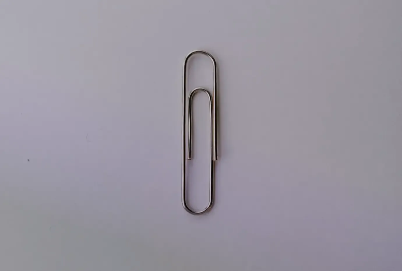
The KISS principle ("Keep It Simple, Stupid") was originally coined by aircraft engineer Kelly Johnson and popularised by the U.S. Navy in the 1960s.
The core philosophy is straightforward: the simpler a product or communication is, the higher its chances of successful user engagement.
In our hyper-connected daily lives, the value of simplicity is paramount, yet easily overlooked. At MadeByPi, we believe that stripping away friction isn't just good design, it’s therapeutic for the user and highly effective for the brand. As the old cliché goes, "it’s the simple things in life". In the world of digital product design and conversion rate optimisation (CRO), that cliché is an absolute law.
Form Follows Function
Ultimately, the goal of any digital object or interface is problem-solving and clear communication. How we solve those problems visually and technically is where the expertise lies. While guidelines exist to steer the user experience, mastering these frameworks allows us to push boundaries and innovate responsibly.
During his time at MIT, designer and technologist John Maeda published The Laws of Simplicity (2006). Though the technology landscape has evolved rapidly since then, these foundational laws have stood the test of time. As we build increasingly data-driven, product-led digital experiences, these ten laws serve as our reference point for design, technology, and business strategy.
The 10 Laws of Simplicity (UX focus)
1. Reduce
"Perfection is achieved, not when there is nothing more to add, but when there is nothing left to take away." Antoine de Saint-Exupery
The most direct path to simplicity is thoughtful reduction. The real skill lies in the complex balancing act of stripping away non-essential clutter for improved usability. We see this constantly in modern brand identity and minimalist UI design. In a world where consumers are bombarded by thousands of brand messages daily, a clean, instantly recognisable interface wins.
2. Organise
Organisation makes a complex system appear fewer. By controlling layout complexity through smart information architecture (IA), we help users instantly digest and manage what is being communicated to them. Categorisation is a test of logic; moving one element inevitably impacts another. The ultimate example: A calendar. It takes 365 chaotic dates and elegantly groups them into 7-day weeks, 52 weeks into 12 months, and 12 months into a single, cohesive year.

3. Time
Savings in time feel exactly like simplicity. The faster a user can complete a task, checkout, or find an answer, the simpler the platform feels. Context is everything here. Think about booking a flight: manually scouring dozens of individual airline websites is slow and frustrating. An aggregator that instantly compares airlines, dates, prices, and accommodation speeds up the task tenfold, transforming a complex chore into a seamless interaction.
4. Learn
Knowledge makes everything simpler. Every digital interaction relies on learned behavior, both from the platform's execution and the user's learned intuition. Just like learning the 26 letters of the alphabet allows a child to eventually master complex sentences, regular interaction with predictable UI patterns makes software effortless to use over time. However, learning takes time. By reducing cognitive load (Law 1) and saving user time (Law 3), we accelerate this onboarding process.

5. Differences
Simplicity and complexity need each other. Without the contrast of complexity, we cannot truly appreciate simplicity. In product development, "feature creep" often threatens to overwhelm the user experience. This dynamic creates a predictable digital product lifecycle:
- Users flock to a simple product
- The product adds features to satisfy its growing user base
- The product becomes bloated
- Users abandon it and flock back to a newer, simpler product
Recognising these boundaries helps us protect the core value of the user journey.
6. Context
While a user interface might look minimal at face value, there is deep engineering and strategic reasoning sitting just beneath the surface. Complexity makes a user feel lost, simplicity makes them feel found. When designing complex systems, our team adopt a test and learn philosophy. Exploring and questioning every possible variable first, before narrowing down to fine-tune contextual details of any given variable.

7. Emotion
More emotions are better than less. Simplicity doesn't have to mean sterile. While minimalism appeals to some, human beings inherently crave emotional connection. This is why we design micro-interactions, thoughtful copy, and smart assistive technologies (like Siri or Alexa) that give personality to otherwise lifeless code. When user emotion is the priority, adding layers of meaning or subtle visual delight is entirely justified, provided it respects the overall context.
8. Trust
In simplicity we trust. The modern web operates on an invisible trinity: Usability > Simplicity > Privacy. For a digital product to feel seamless, users must inevitably hand over data. If an application demands too much data too quickly without demonstrating clear value, user trust collapses and engagement fails. Striking a balance between an usable interface and a transparent, trustworthy relationship is one of the defining challenges of modern digital design.

9. Failure
Some things can never be made simple. To build high performing digital products, you have to iterate and learn from what doesn't work. As Thomas Edison famously noted, failing is just finding the ways that won't work. In UX design if a user flow fails to convert or communicate clearly, we diagnose the friction point, adapt our understanding of the user problem, and engineer a better solution.
10. The one
Simplicity is about subtracting the obvious and adding the meaningful. This single law perfectly summarizes the entire philosophy. If an element on a page is glaringly obvious or redundant, it’s clutter—remove it. Replace it only with features that provide genuine, measurable value to the end user. During the 1960s space race, a famous urban myth claims NASA spent millions developing a high-tech pen that could write in zero gravity, while the Soviet space program simply handed their cosmonauts a pencil. True or not, the lesson holds: don't over-engineer a problem when a straightforward, elegant solution is staring you in the face.
As Leonardo da Vinci said: "Simplicity is the ultimate sophistication."